Engaged in the clothing industry for 20 years.

These are the colors for SS26 according to WGSN
Blue/green (Transformative Teal), bright pink (Electric Fuchsia), blue/grey pastel (Blue Aura), amber yellow (Amber Haze), and mint green (Jelly Mint) are the five colours that trend forecasting agency WGSN, has chosen as part of its Coloro programme.
According to WGSN, 2026 will be the year of reorientation. Old ideas will be overthrown and the public will demand urgent change in the way societies, industries, and the environment are managed. This will translate into a palette with a mix of bright colours that embody urgency, unusual hues that symbolise nature and the earth, and soothing shades.
Transformative Teal: Shifting perspectives in light of the climate crisis
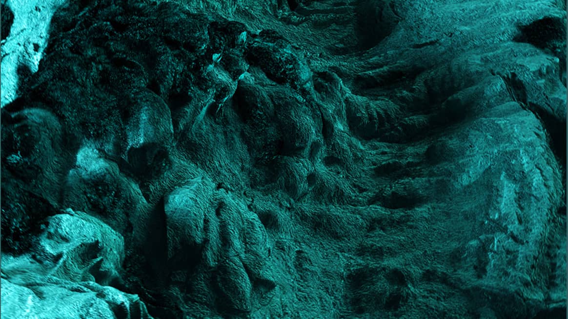
Transformative Teal meets the growing consumer demand for ecological responsibility. This fluid fusion of blue and green references nature in all its diversity, as well as a “planet first” mentality. Transformative Teal reflects a new approach to biology – organic or synthetic, natural or post-natural – geared towards what is best for the earth.
Electric Fuchsia: The multisensory and psychedelic response to the advent of artificial intelligence
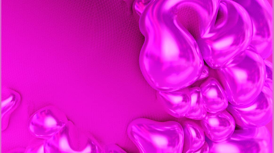
Electric Fuchsia, between pink and purple, evokes progressive and provocative attitudes and aligns with WGSN’s theme of rebellious resilience. In a context of anger and frustration over social inequalities, Electric Fuchsia offers a nuanced perspective of necessary levity. It provides a sense of escapism and recalls the aesthetics of post-human universes, born from synthetic creativity.
Blue Aura: The appeal of gender inclusivity and trans-seasonality
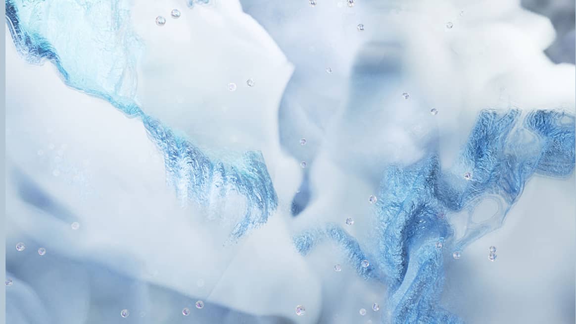
Blue Aura is a tinted pastel, a blue-grey – serene, soothing, and modern. Inspired by light and shadow, its name refers to its healing quality. It can be layered or used purely and lends itself well to the trend of luminous design. Its shiny and cloudy appearance is reminiscent of biodegradable designs made to disappear, recycled industrial waste, and tinted plaster.
Amber Haze: The search for spirituality and guidance towards ancient wisdom
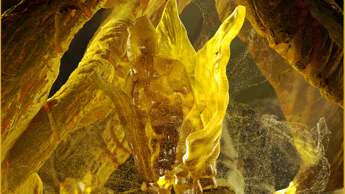
Amber Haze is a rich and radiant yellow, with a hint of green. In a digitised world, based on screens and connected lifestyles, Amber Haze with its earthy character invites us to slow down and pay attention to regenerative resources. This primitive hue is also inspired by the themes of earth and longevity. With its aged appearance, similar to that of stones and crystals, Amber Haze fits into the search for sustainable colours.
Jelly Mint: The kawaii (cute) world, dear to the ‘kidult’ consumer (half teenager, half adult)
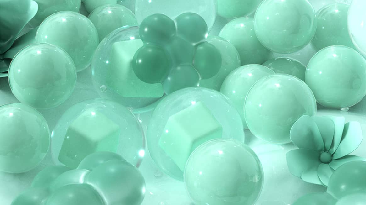
Jelly Mint is a nostalgic and playful hue, in tune with the theme of ‘glimmers’ – micro-moments of joy that help you reorient yourself to feel calm. The power of this colour lies in its ability to challenge and transform the norm. It strengthens resilience and boosts mental health. Let’s not forget that the fashion of cuteness, once seen as childish, has become one of the most influential forces in contemporary culture.
This article was originally published on FashionUnited FR. Translated by AI, edited and clarified by Rachel Douglass.


