Engaged in the clothing industry for 20 years.

Spotted on the catwalk: WGSN and Coloro’s key colours for SS25
As part of their biannual webinar, WGSN and Coloro unveiled their five trend colours that can be
expected to lead the way during the SS25 season. Each of the hues were
selected for their ability to convey a sense of reassurance at a time of
great uncertainty and global change, the trend authorities said, while also
reflecting a “shift towards strategic imagination”.
To encourage inspiration, FashionUnited has compiled some looks from
recent runway collections in the colours selected by WGSN and Coloro.
Future Dusk
Coming out on top as Colour of the Year for 2025, ‘Future Dusk’ was
presented as a “reliable blue” by head of colour at WGSN, Urangoo Samba,
during the webinar, who said that the hue instilled “a sense of confidence
and stability” while driving “the creation of new futures”. According to
Samba, the decision to select such a tone was linked to the authority’s
forecast that dark hues were to gain momentum during this period, as they
tap into a time of transition.
Future Dusk could already be seen in numerous iterations as part of
recent designer collections, many of which could be linked to WGSN’s idea
that the colour has a strong connection to the current fascination with the
second space age. At Alberta Ferretti’s ‘24 Resort, for example, the hue
was used in combination with contrasting materials that formed a hooded
dress with a panelled bodice, reminiscent of sci-fi attire. Meanwhile, at
Saint Laurent’s SS23 show, the colour was present in a floor-sweeping
leather coat resulting in a modernised take on the Matrix.
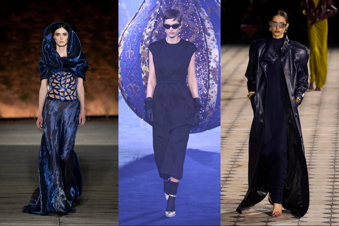
FW23, Saint Laurent SS23. Credit: Spotlight Launchmetrics
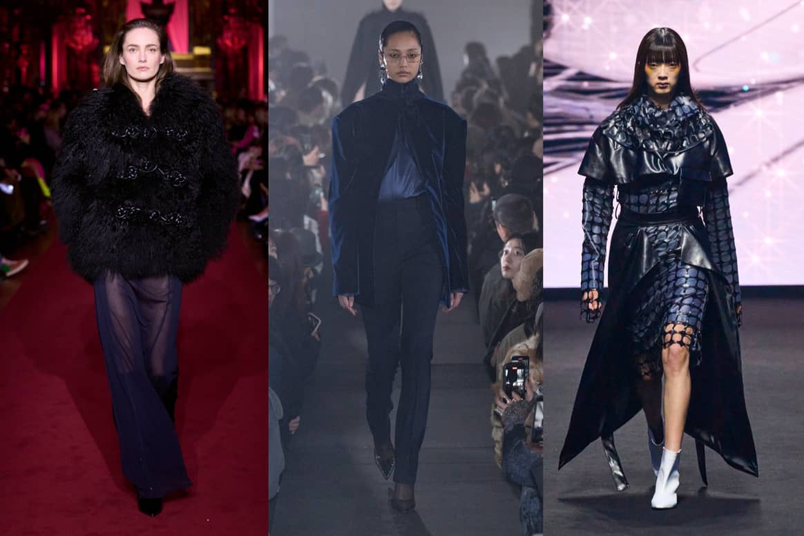
FW23, M Rof FW23. Credit: Spotlight Launchmetrics
Transcendent Pink
Transcendent Pink is versatile and suitable for people of all genders
and demographics, making it a “commercially reliable” choice, stated
Caroline Guilbert, the creative content lead at Coloro. Unlike other pinks
that have recently been popular – namely that of Barbie’s hot pink – this
tone takes on a more subtle shade that comes across as earthy, therefore
carrying a sense of stability, as suggested by Guilbert.
For past seasons, many designers opted to use the fluid tone for
eveningwear, seeing it incorporated into slinky dresses, heavy
embellishments and flowing gowns. While a sheer dress with cowl neckline
came weighted in crystal beading at Versace’s FW23, during the show of the
typically bohemian Zimmerman, the tone was seen in a striking dress with
ruffles traversing down the body. Other designers, however, used the
opportunity to show this pink in a different light, incorporating it into
outerwear attire, like ski coats and knitwear. A look in MaxMara’s
collection saw the tone appear in a head-to-toe outfit, with chunky knits
layered under a voluminous coat.
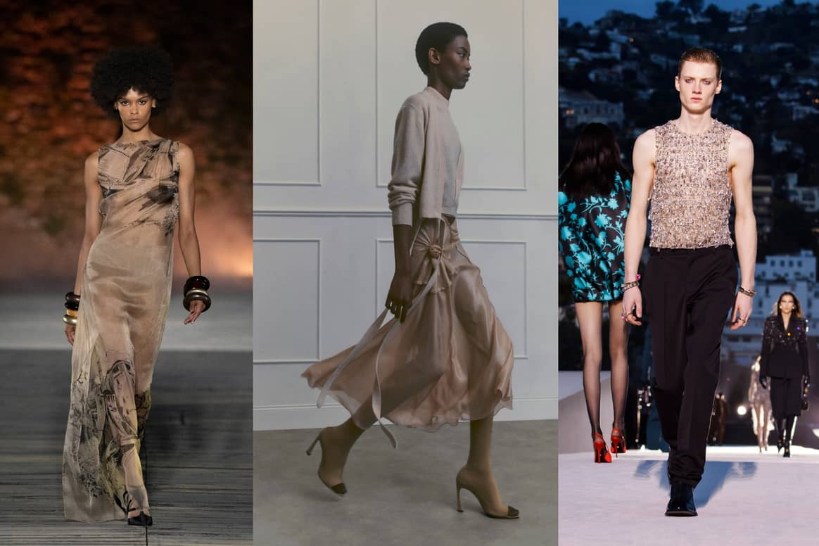
Victoria Beckham Resort 2024, Versace Fall/Winter 2023. Credit: Spotlight
Launchmetrics
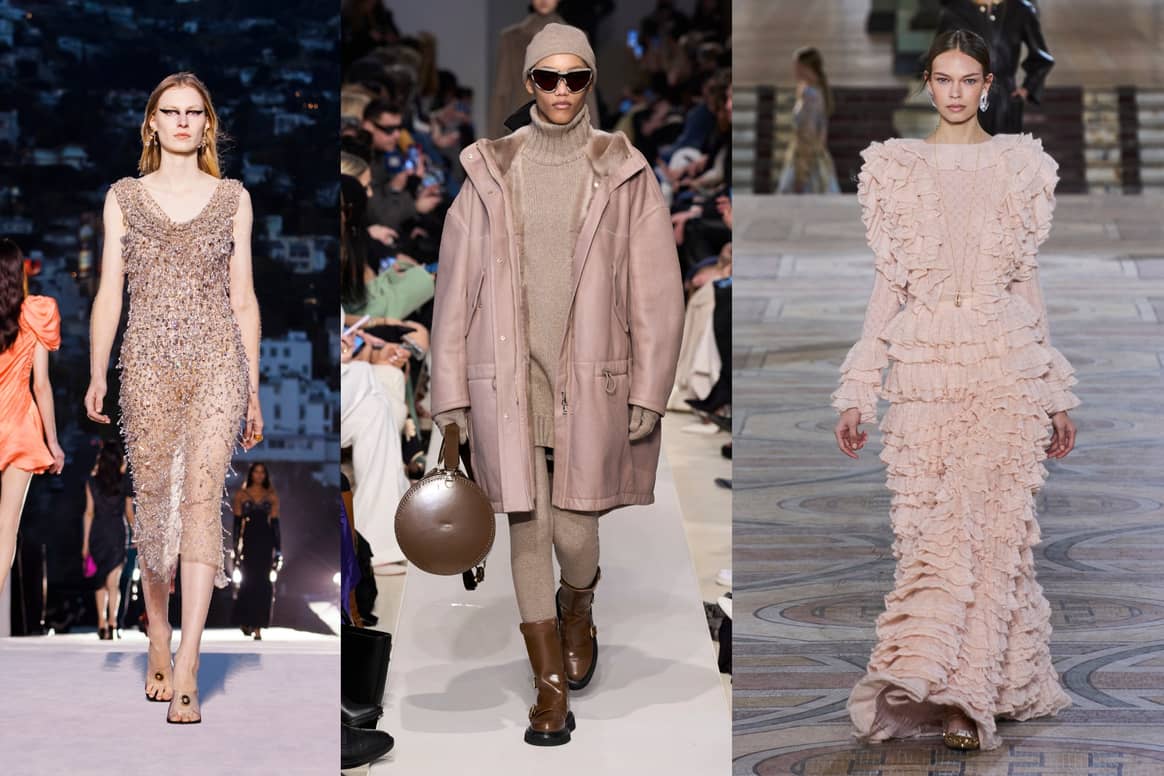
MaxMara Fall/Winter 2023, Zimmermann Fall/Winter 2023. Credit: Spotlight
Launchmetrics
Aquatic Awe
This colour tone has a dual nature, embodying elements of both the
natural world and the virtual realm. Aquatic Awe draws inspiration from
marine life and its ecosystems, while also reflecting the growing trend of
immersive virtual worlds. This unique combination bridges the gap between
fantasy and reality, as noted by Samba, who labelled the tone among her
personal favourites for 2025.
Like its duality, designers that incorporated Aquatic Awe into their
collections also presented differing outcomes, with the tone appearing on
everything from streetwear to eveningwear to more experimental
ready-to-wear. While Aitorgoikoetxea offered up the aqua-like hue in a
netted cardigan, Speed took on an alternative of the suit, with a velvet
skirt and blazer combo that saw the colour in an ombre print. Victoria
Tomas, on the other hand, served an update to streetwear, using the tone in
a metallic translucent material for a sheer co-ord.
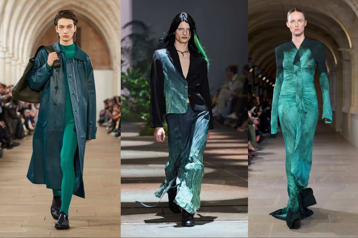
Victoria Beckham FW23. Credit: Spotlight Launchmetrics
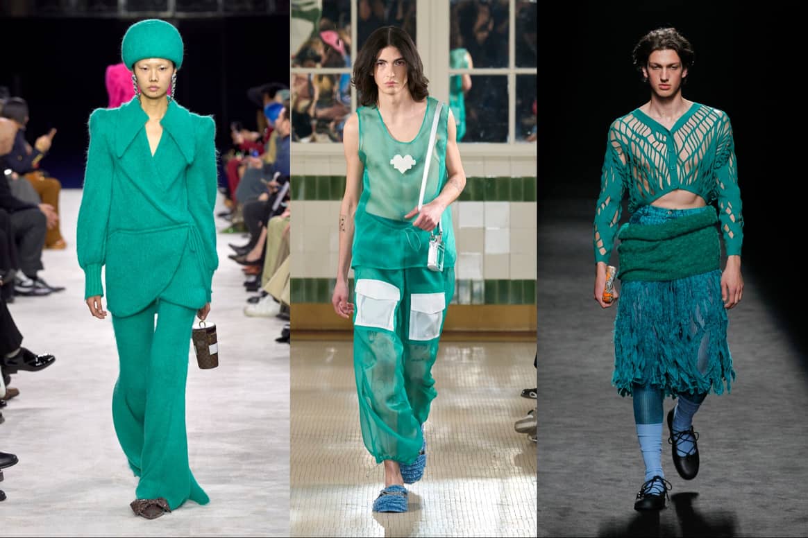
Aitorgoikoetxea FW23. Credit: Spotlight Launchmetrics
Sunset Coral
This new take on coral looks to serve as a remedy for society’s fixation
on productivity and, despite its vibrant appearance, encouraging
individuals to embrace moments of idleness and relaxation, Coloro’s
Guilbert said. Additionally, the colour expert discussed the notion of
“conscious hedonism” associated with Sunset Coral, as it aims to forge a
meaningful connection between moments of indulgence and a greater sense of
purpose. Like a breathtaking sunset, this shade embodies both joy and
significance.
While coral has been a consistent part of recent fashion seasons past,
this fresh iteration of the hue provides a bolder take on the usually
subdued pigment. This was also reflected in its runway appearances
throughout 2023 seasons, where daring shapes and experimental silhouettes
led the way. For its own FW23 collection, Act N.21 took on the shade in a
fishtail gown whose neckline blossomed into an exaggerated fluffy cloud.
Meanwhile, Palmer Harding played with silhouette as a whole, as seen in a
dress that was gathered and tied in various locations forming an
asymmetrical hem.
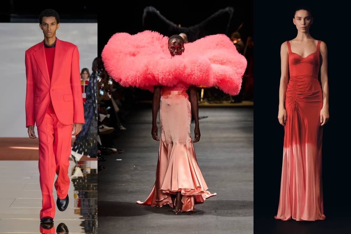
Credit: Spotlight Launchmetrics
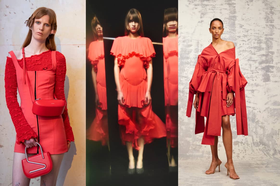
SS23. Credit: Spotlight Launchmetrics
Ray Flower
When speaking on Ray Flower, Coloro cited the work of multidisciplinary
designer Jess Redgrave – who works with sunflowers to make natural dyes –
as the source of inspiration for this vibrant yellow shade. Ray Flower was
described by Samda as “inherently optimistic and soothing”, and referenced
the growing trend towards more radical sustainability, where the
environment is seen as a valued stakeholder in design and production.
The bold tone was used in a similarly daring way for its appearance in
designer collections, where it held a surprising versatility and exhibited
many uses. For Ferragamo and OffWhite, the yellow appeared in the form of
outerwear, in contemporary raincoats and parka-trouser combos. In a notable
contrast, Jil Sander and Dundas presented the shade in red-carpet-ready
eveningwear, either used in a structured sweeping skirt or for a silky
flowing maxi dress.
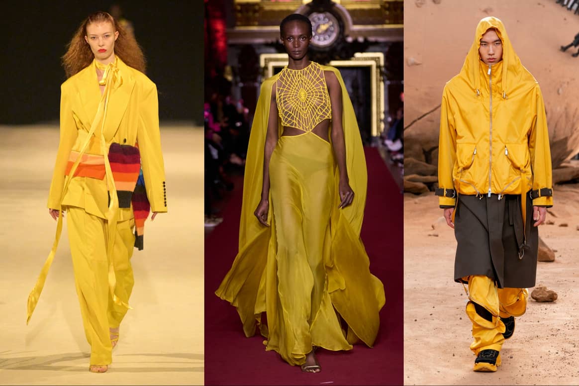
2024, Dundas FW23, OffWhite FW23. Credit: Spotlight
Launchmetrics
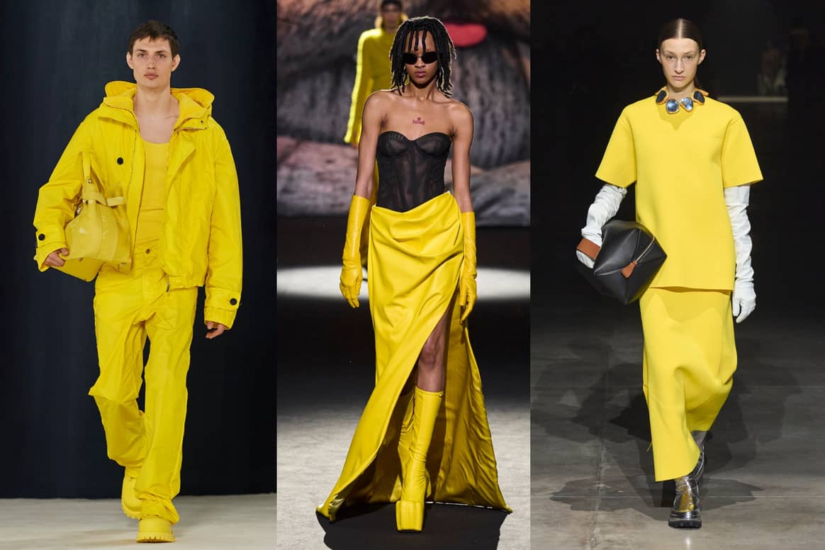
GCDS FW23. Credit: Spotlight Launchmetrics
This article has been edited by Jule Scott, Rachel Douglass
and Esmée Blaazer.