Engaged in the clothing industry for 20 years.

Puig unveils new identity
Puig is turning a new page in its history via the introduction of a new visual identity. As such, the group, specialising in fashion, fragrances and cosmetics, said it wants to celebrate its heritage while looking to a promising future.
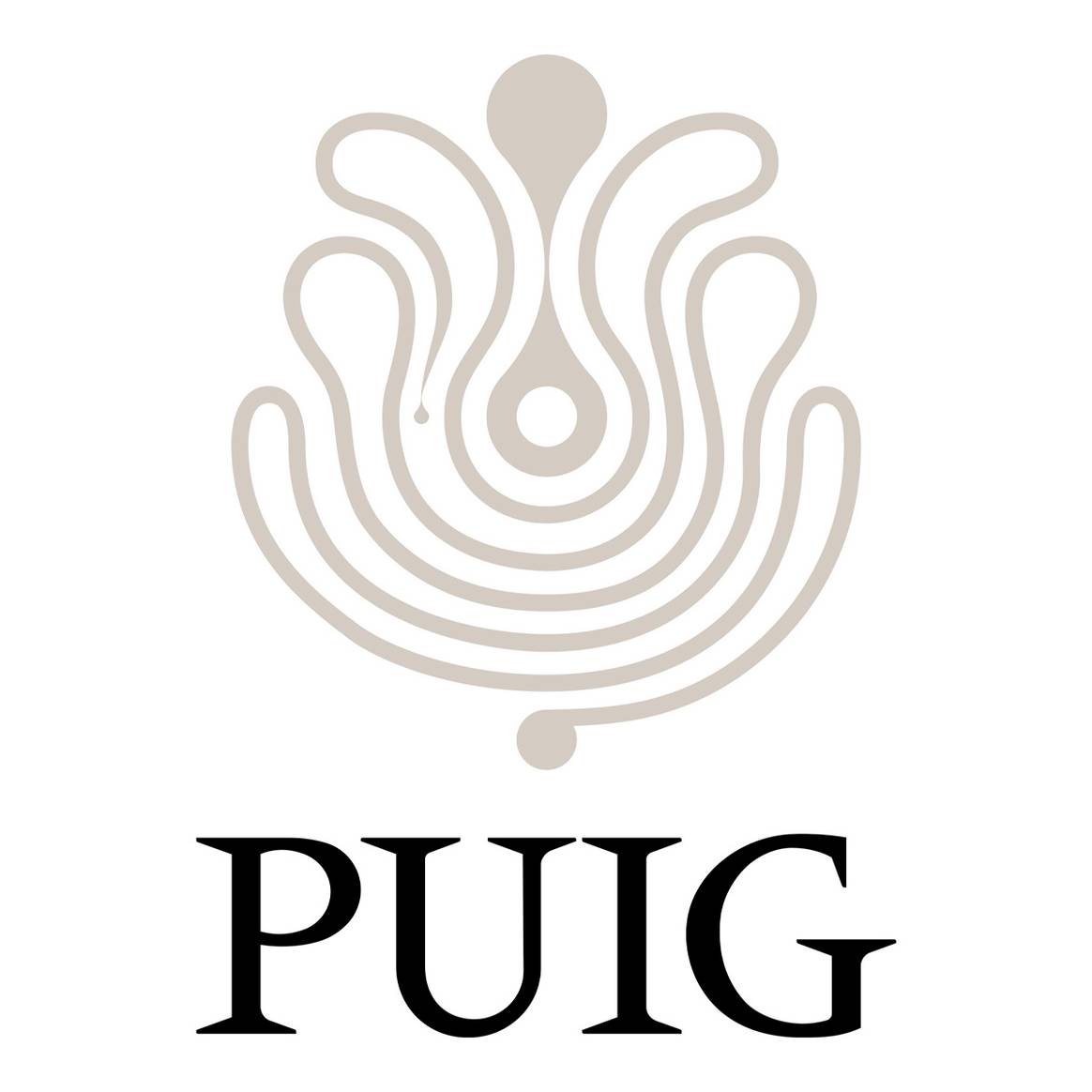
To design its new logo, the Spanish firm called on the French art and design agency M/M to build on the work done by Swiss designer Yves Zimmerman a few years earlier.
The agency came up with a modernised logo using a bespoke typeface, “Paralelo”, which reinterprets the spirit of “Méridien”, the typeface designed by Adrian Frutiger in 1955 and used by Zimmerman for Puig over 50 years ago.
It also incorporates a new symbol that evokes an infinite line of creativity, inspired by a painting of Miró, and echoing the logotype designed by Zimmerman in the 1970s.

In a press release, chairman and CEO of the group, Marc Puig, said: “At this moment of transformation for Puig, we wanted to consolidate our identity, missions and values as the ‘Home of Creativity’.
“We link our long history with our commitment to innovation, our discretion with our sensibility, creating a place where brands can shine, where people can flourish and where bold ideas are celebrated.”
The new identity was used for the first time at the stock market opening ceremony in Barcelona on 3 May. It will gradually be incorporated into all elements associated with the group.


