Engaged in the clothing industry for 20 years.

Coloro and WGSN: The colour trends for SS25
First, the trend research institute WGSN, together with colour experts
Coloro, named ‘Future Dusk’ the colour of the year. Now, the duo have
announced the full colour spectrum for spring/summer 2025 during a webinar.
Amid global change and increasing uncertainty, the duo’s key colours convey
a sense of reassurance and exert a powerful pull, Coloro said. Moreover,
the colours “reflect a significant shift towards strategic imagination”. It
is these innovative ideas that will be crucial in solving the current
global challenges.
Coloro
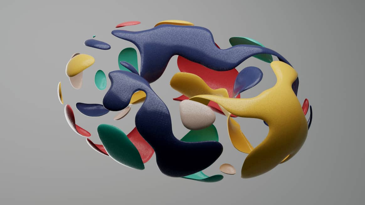
Future Dusk
The colour of 2025, Future Dusk [129-35-18], seems unusually
sombre for a spring/summer season at first glance, but captivating, dark
hues will gain prominence in 2025 – even in spring – according to Urangoo
Samba, head of colour at WGSN. The moody and captivating hue taps into the
current time of transition – be it the shift from darkness to light or dusk
to dawn – and is therefore particularly suited to the current changes, he
stated. “This reliable blue will go a long way towards reinforcing a sense
of confidence and stability, but as a violet it also has a fantastic
quality that will dynamically drive the creation of new futures,” said
Samba.

Coloro
In addition, the colour is also in line with the current fascination
with the second space age and gives it a “celestial aura”, Coloro said in a
statement. The colour tone is both reliable and futuristic, depending on
how you look at it.
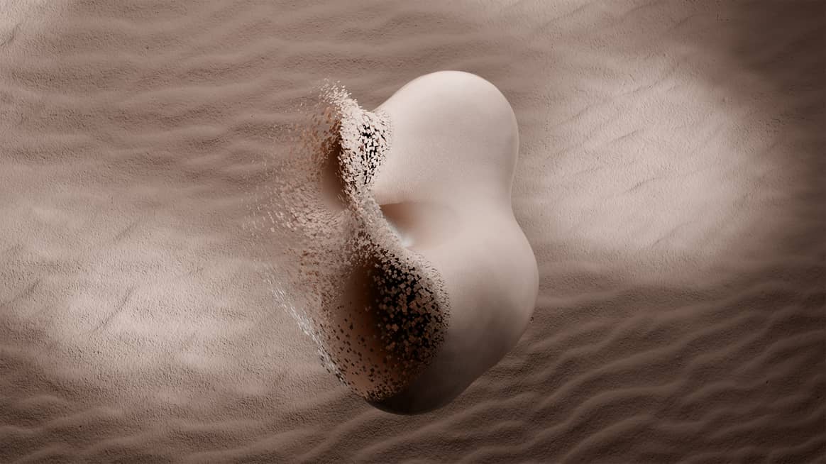
Transcendent Pink
With Transcendent Pink [086-70-25], the name does not necessarily
say it all, because this is not – as one might assume – a shade of pink,
but rather a kind of old rose. Coloro describes Transcendent Pink as an
almost imperceptible shade with an earthy and balancing effect, carried by
a sense of stability. Moreover, despite its categorisation as a SS25
colour, the shade is cross-seasonal. It is suitable for all genders and
demographics, which is why Caroline Guilbert, creative content lead at
Coloro, also called it “commercially reliable”.
WGSN. Image: Coloro
The virtual project ‘Metaserai’ by the architecture firms Grimshaw,
Farshid Moussavi, HWKN and Why, who worked with the NFT and Metaverse
company Pax.World, proves that colour is not only grounded in reality, but
is also already resonating in the Metaverse. Together, the firms created a
virtual world based on the Silk Road, a historical trade route.
Aquatic Awe
The transformative turquoise Aquatic Awe [086-70-25] takes its
name from the book “Awe: The Transformative Power of Everyday Wonder” by
author Dacher Keltner. Like its namesake work, the colour calls for
“cultivating wonder”, said Samba. The colour expert counts the shade, which
celebrates the strange and wondrous aspects of nature but is also ideal for
connecting with the digital world, among her personal favourites for
2025.
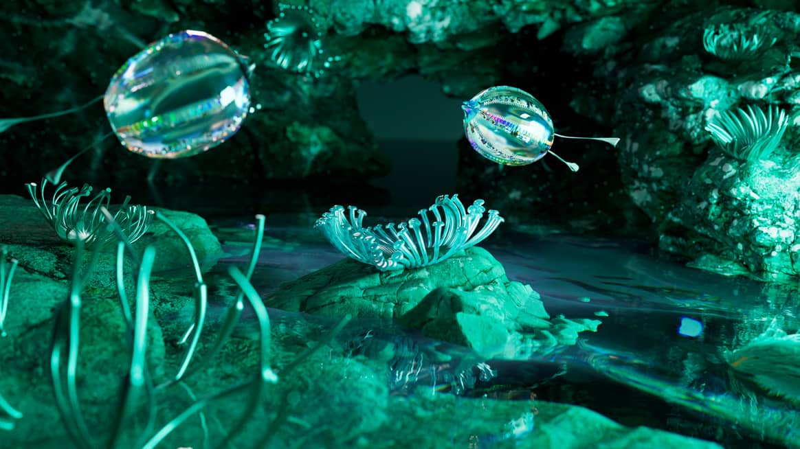
Image: Coloro
The duality of the colour tone, which appears both natural and virtual,
bridges the gap between fantasy and reality, Samba explained further.
Aquatic Awe is reminiscent of marine life and its ecosystems as well as the
increasingly popular immersive virtual worlds.
Sunset Coral
“Sunset Coral is a colour that appeals to our desire for the simple
pleasures in life,” said Coloro’s Guilbert about the coral colour.
Sunset Coral [009-58-31] is an antidote to the current obsession
with productivity and – despite its energetic appearance – invites people
to enjoy doing nothing.

Image: Coloro
The colour experts also spoke of “conscious hedonism” in connection with
Sunset Coral, because the shade, which is also reminiscent of a sunset, is
intended to help connect moments of pleasure with a sense of meaning and
purpose.
Ray Flower
The fifth colour for the SS25 season, Ray Flower [037-832-32],
brings not only sunshine but also plenty of optimism. Coloro cited the work
of multidisciplinary designer Jess Redgrave as the source of inspiration
for the radiant yellow shade. The Brit is best known for her Clima Fibre
project, for which she developed fibres for textiles, natural dyes and a
hydropic coating made entirely of sunflowers.
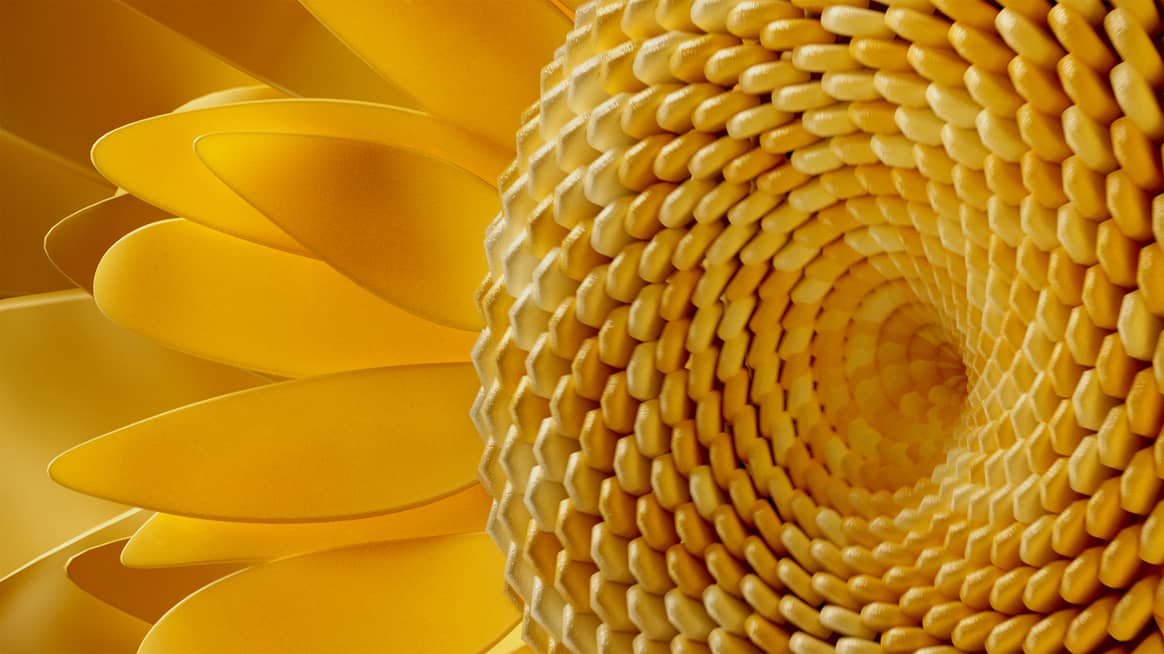
Image: Coloro
“This colour is inherently optimistic and soothing,” said Samba. “Ray
Flower fits the growing trend towards a more radical, considerate approach
to sustainability, where the environment is treated as a customer in design
and production, and nature as a member of the management.”
This article originally appeared on
FashionUnited.DE.
Translation and edit by: Rachel Douglass.


